Prompting GPT Image 2
After a month with the model: ten patterns I keep returning to, three workflows I have found useful, and the questions I am still asking. A working notebook for architects and interior designers, not the last word.
A working notebook, not a finished guide.
OpenAI released gpt-image-2 on 21 April 2026. A month in, I have spent enough hours with it to notice patterns, and enough to know that what I have found so far is a fraction of what is there.
I am an architect, not an ML researcher, and I have been treating the model the way I would treat any new tool that landed on my desk: using it on real briefs, watching where it surprises me, and writing down what seems to repeat. The ten patterns in Part One are the ones I keep returning to. The workflows in Part Two are the ones I now reach for first. Neither set is finished.
What I am noticing is that the model rewards specific visual facts over adjectives, and rewards constraint language over decorative praise. Findings that converge across early case studies from Archtene, Rendair, and the fal.ai prompting guide. OpenAI's own Cookbook is explicit: for photorealism, include the word “photorealistic” to engage that mode; for edits, repeat what must be preserved on every turn.
What pulled me in: gpt-image-2 is the first general-purpose image model that responds to a prompt the way a contractor responds to a drafting brief, with hierarchy, materials, constraints, and intent. That is a shift, and I do not think I have fully metabolised it yet.
Read this as a starting point, not a conclusion. Every feature image here is a gpt-image-2 output, not stock, not retouched. Each is also a thing I learned something from making. If you find something I have not, please tell me at chiangning.net.
Before I write a brief, I check the machine.
Parameter-level realities I had to internalise the hard way, by asking the model for things it structurally could not deliver and burning credits to find out. It saves me a beat to glance at this first.
Ten patterns I keep returning to.
I am not sure these are principles yet, that is a word for things you have tested across years. But in a month of using the model on real briefs, these are the moves that have shifted my output the most. Each one earned its place. Most still have edges I have not found.
I write in a fixed order.
Scene, subject, details, constraints, use case.
I tested this against a single dump-everything-in paragraph for two weeks. The structured version won every time. For a render I write: scene is site and time of day, subject is the building or room, details are materials and camera framing, constraints are what must not change, and use case (competition board, client presentation, magazine editorial) sets the polish level.
Short labelled segments with line breaks, not a single run-on. The model treats a structured brief as a brief, and an adjective soup as an adjective soup. What I am still asking: does the order itself matter, or just the labelling?
I replace style words with their visual atoms.
Minimalist, brutalist, Japandi on their own are weak triggers. I have seen the model deliver competent but generic outputs to all three, the same competent generic each time. The single highest-leverage move I have found is to break a style label into the materials, palette, and silhouette rules underneath it. Every canonical style compresses to a finite list. Write the list.
Board-formed exposed concrete with visible wooden formwork striations, aggregate texture, cantilevers, deep recesses, raw concrete grey with rust staining, modular repetition, high-contrast raking shadows.
I trigger photorealism by name, then anchor it with texture.
The OpenAI Cookbook says it directly: including “photorealistic” engages a photorealistic mode. Pairing it with texture-forward nouns (real skin texture, pores, subtle film grain, brushed aluminium with micro-scratches, weathered copper patina, chipped paint, worn travertine) does more than the word alone.
Archtene's phrasing (smooth realistic quality like 3Ds Max and V-Ray rendering, accurate shadows, reflections and architectural realism, materials feel natural and premium, less plastic) pulls renders away from the default oversaturated gloss. I now use it as a tail on most photoreal briefs. What I have not worked out: is “less plastic” really doing work, or am I just superstitious about it?
I treat camera language loosely. Composition precisely.
The Cookbook warns that detailed camera specs are interpreted loosely: lens lengths influence look, not physics. I write “medium close-up at eye level, 50mm lens feel, shallow depth of field, 35mm film aesthetic” rather than a sensor-and-aperture recipe. The mood lands; the dimensions do not.
For composition I am literal. “Corner perspective at eye level, slight three-quarter angle, hero object centred with generous negative space, horizon line in the lower third.” Corner perspectives outperform flat front elevations because they reveal depth and form, a thing Archtene flagged early and I keep verifying.
I treat edits as a two-column contract: change plus preserve.
This is the move that has reshaped my iteration practice the most. Every edit prompt I write now states explicitly what changes and, repeated every turn, what must be preserved.
Replace ONLY the white chairs with chairs made of wood. Preserve camera angle, room lighting, floor shadows, and surrounding objects. Keep all other aspects unchanged.
Without the preservation clause, I see drift in saturation, reflections, background. Without repeating it on every turn, the drift compounds. What I am still testing: how stable is preservation across six or more iterations on the same room? My informal answer so far is “less stable than I want.”
I iterate one change per turn.
Both fal.ai and Archtene arrived at this rule independently, and I keep landing in the same place. A single surgical edit (warm the lighting, mature the trees, soften the façade finish) beats a large rewrite every time. Combined with Pattern V: the preserve list stabilises what I already like while one knob moves. I think of it as CAD versioning. Wishing will not make it work.
“Is a prompt closer to a brief, or to a conversation?”
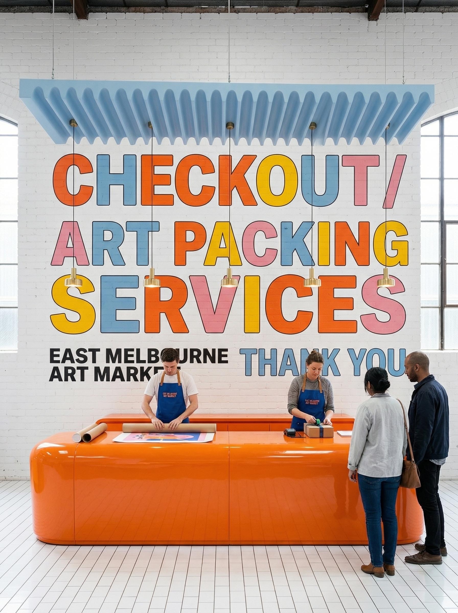
I treat in-image text as typography, not content.
For signage mockups, wayfinding studies, and presentation boards with captions, I put the literal string in quotes or ALL CAPS, specify font family (Inter, condensed sans, humanist serif), size, colour, placement, kerning, and add the bluntest line: “render the text exactly once, no duplicate text, no extra words.”
Use quality high for small text. PixVerse's informal fifty-prompt test found roughly nineteen of twenty generations returned legible first-pass text on gpt-image-2 when prompted this way, a result I did not quite believe until I ran my own and saw similar numbers. Open question: does the 19 in 20 hold for non-Latin scripts? I have not tested.
I name the render mode.
Photorealistic, or architectural?
“Photorealistic” for renders, “architectural render” for concept boards. Archtene's tested template (building type, style, materials, camera angle, lighting, site context, architectural render, realistic proportions, clean presentation, design-focused composition) produces the flat, even, competition-board aesthetic I want for concept work.
“Photorealistic candid photograph” gives me client-facing heroes with weather and atmosphere. Both modes are there. I name which one I want. What I am noticing: the boundary between modes is fuzzier than I first thought; there is a hybrid sketch-render territory I keep stumbling into accidentally.
I treat reference images as indexed inputs, addressed by number.
For multi-reference compositions (a site photo plus a finishes board plus a furniture swatch) I label them explicitly in the prompt.
Image 1 is the existing room to preserve. Image 2 is the wood grain reference. Image 3 is the sofa reference. Apply the wood from Image 2 to the flooring in Image 1; replace the sofa in Image 1 with the sofa from Image 3. Match scale, cast shadows, and white balance to Image 1.
Gpt-image-2 accepts up to sixteen references per edit call and processes every one at high fidelity, though I have not yet pushed past eight on a single brief. Open question: at what number does the model start dropping references?
I add scale cues. I do not trust proportion.
The model does not render to construction dimensions and never will. Rendair's caution (the model tends to dream over geometry) has held up across everything I have tested. So I seed scale explicitly, with bodies and objects at known sizes:
One parked car at the curb, two pedestrians walking at adult height, café tables and chairs on the terrace, bicycles against the wall, garden lighting at knee height.
Human and object references calibrate the model's sense of storey height, door widths, and furniture depth more effectively than any numeric prompt I have tried.
Three workflows. Where the patterns earn their keep.
A grammar without sentences is inert. Three workflows are where I have found gpt-image-2 actually slotting into my existing process: concept boards, photoreal renders, and material studies. None of these has replaced anything in my stack. All three have changed the cadence of how I get to a first sketch.
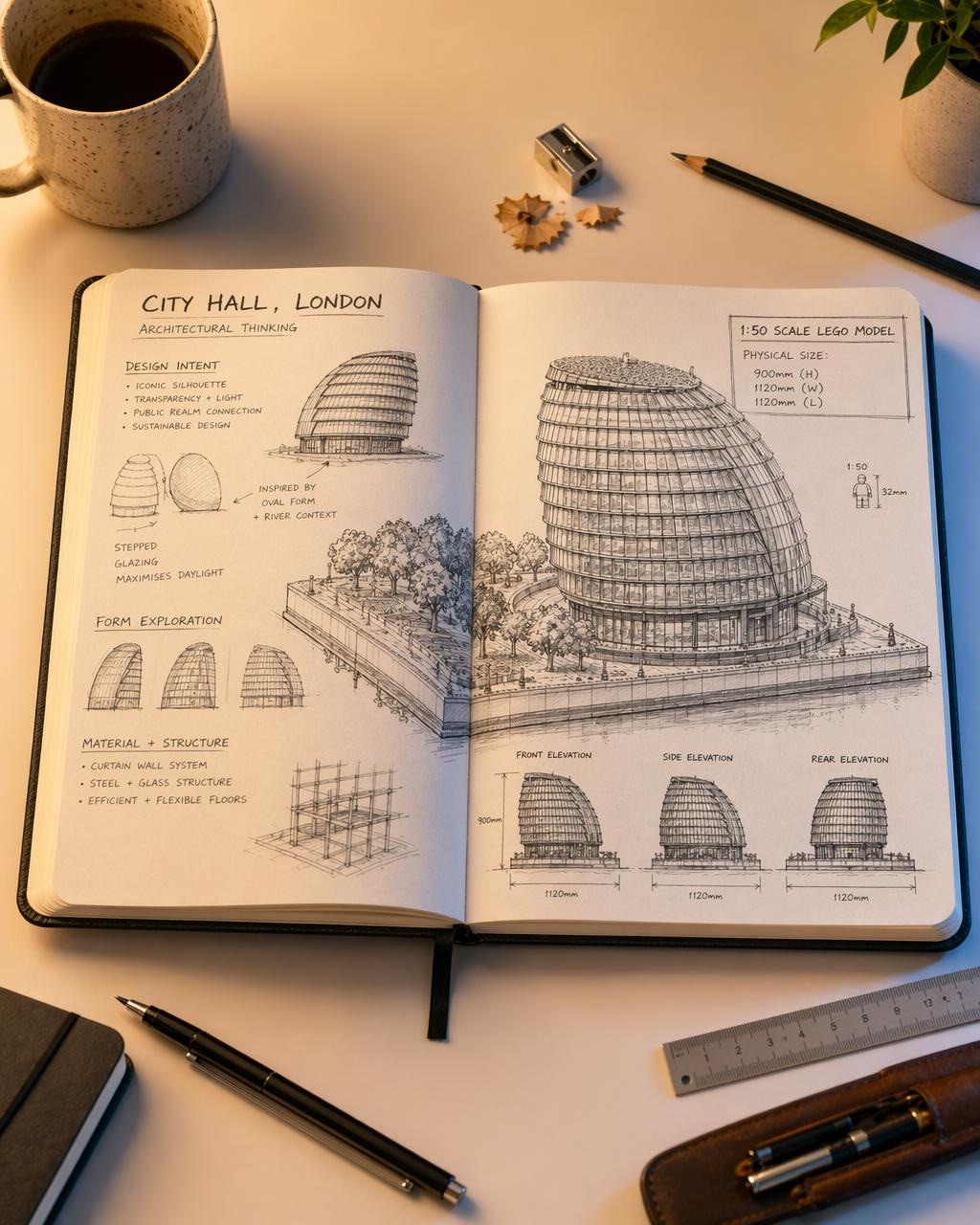
The digital sketchpad. I generate four, then I commit.
For early ideation, the model has become what Rendair calls a digital sketchpad. The Cookbook's n=4 parameter is what makes this work: four variants from one brief, side-by-side, costs me roughly sixteen cents and a couple of minutes. Faster than writing four separate prompts, and the variety is genuinely useful.
Open sketchbook on a designer's desk, hand-drawn ink studies of a civic building: design intent annotations, form exploration thumbnails, structure detail. Pencils, sharpener, ruler, coffee mug arranged casually around. Soft warm lighting, top-down three-quarter view. Photorealistic.
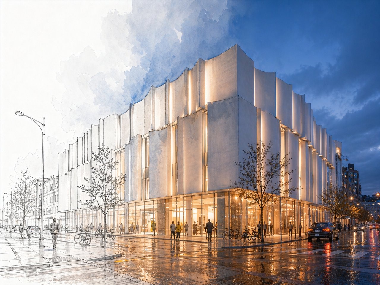
The hybrid sketch-render: my favourite accident with this model.
The output mode I keep returning to is what early users have started calling the hybrid sketch-render: half the image rendered photorealistically with full lighting and reflection, the other half left as graphite line drawing. The first time I got one I assumed it was a glitch. Then I worked out the prompt structure that triggers it, and now I use it deliberately for client-facing work where I want the design intent visible and the aesthetic rendered.
Photorealistic dusk view of a contemporary civic building with a vertical-fluted white facade, glowing warm interior, wet street reflections. The left third of the image transitions into a hand-drawn pencil sketch on white paper: visible graphite linework, ghosted trees, line-only buildings. Smooth blend through the middle third. Eye-level corner perspective.
For more conventional sketch-to-render, Archtene's recipe is the strongest documented workflow I have used for turning Revit, SketchUp, Rhino, or Archicad screenshots into client-ready renders.
Do a realistic render of this photo. Keep the same shapes and forms of buildings, fences, windows and doors. Add lush foliage to planter boxes and landscaping. Make materials feel natural and premium, less plastic.
Floorplan to perspective. I draw an arrow, I get a room.
The Architizer method (drawing a POV arrow on a floorplan, uploading the annotated plan, and prompting the model) has become my fastest path from plan to client-facing perspective. Boyuan Chen, the gpt-image-2 research lead, described 3D-style perspective shifts and complex spatial reasoning through simple text prompts as a headline capability. I think she undersold it.
Create an image of a 3D space from the angle shown on the floorplan as if you are a human standing there.
“If the sketch phase now costs four cents, what is the architect's role on Tuesday morning?”
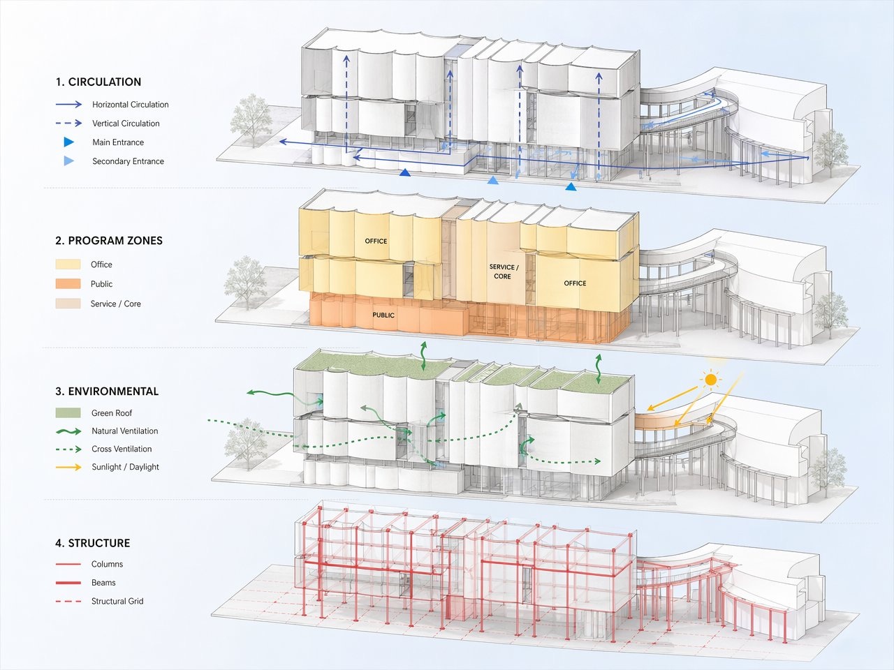
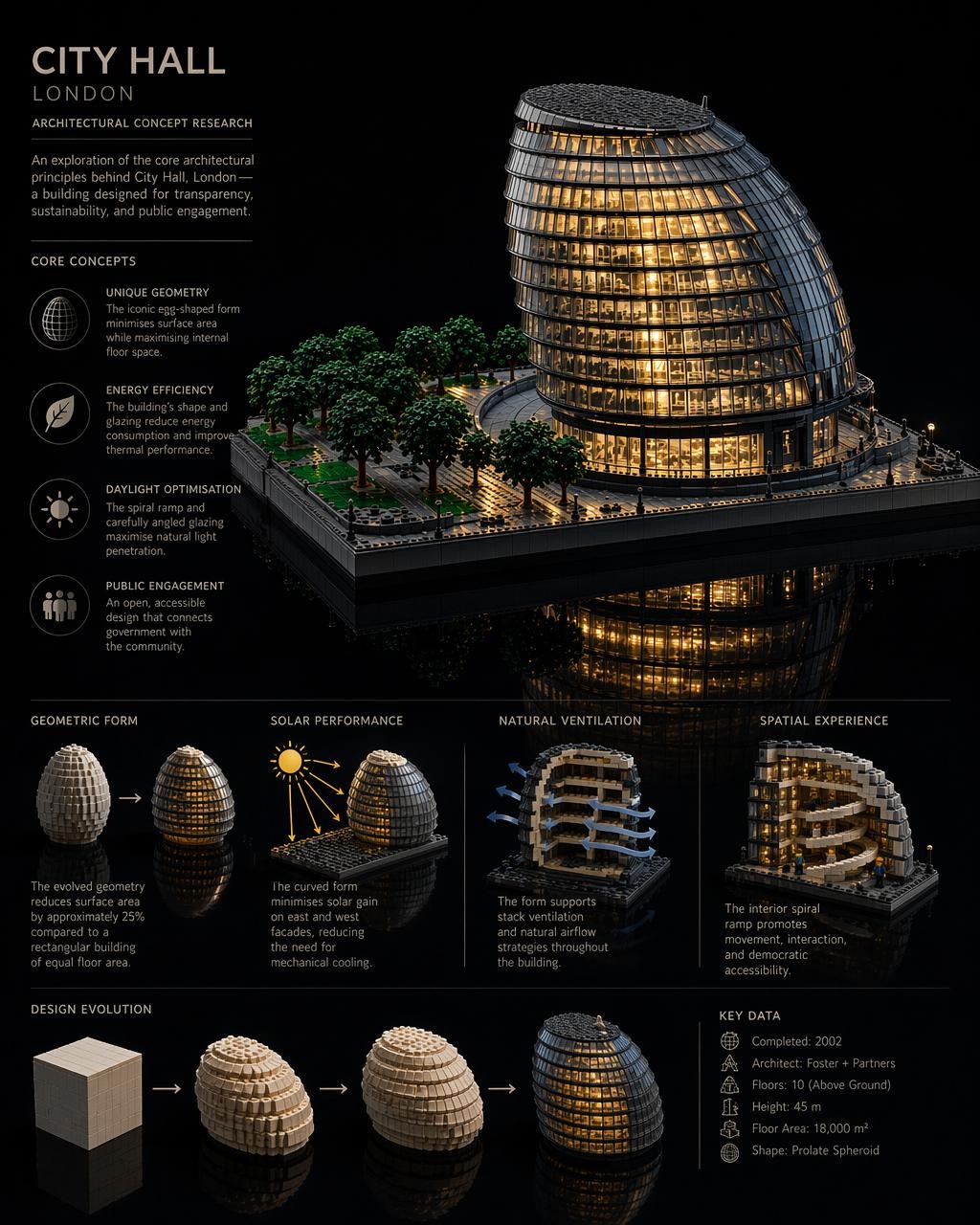
When the model produces a finished spread.
Material studies are where I run most of my edit-endpoint cycles: change one finish, hold the room, look. But the poster below is the output that genuinely surprised me. A complete editorial layout with hero render, four-panel analysis grid, design-evolution sequence, key-data sidebar, and full typographic hierarchy, generated in a single call from a structured brief. I do not yet know what to make of this.
Single editorial poster, dark background. Hero: photorealistic Lego scale model of City Hall London at night, reflected in water. Left column: title block, four core concept icons with body text. Below hero: four-panel analysis grid (geometric form, solar performance, natural ventilation, spatial experience). Bottom: design evolution sequence, key-data sidebar. Typography: condensed sans titles, humanist sans body. Render text exactly as specified.
A CAD tool it is not. But the failures are interesting.
The places gpt-image-2 falls down are also the places I have learned the most about what it actually is. Five failure modes I have run into repeatedly, each followed by what I think it is telling me. None of these are settled.
It dreams over geometry. Anything that requires dimensional precision, repeating fenestration with consistent mullion spacing, or load paths that actually work, the model will confidently invent.
What that might mean — The model is a sketch tool that thinks in mood, not a drafting tool that thinks in measurements. I use it for the former and never the latter.
Logo reproduction is unreliable. Brand marks come back warped, wrong-coloured, or invented. I now composite logos in Photoshop after the fact.
What that might mean — The model has learned logo shape as a generic category, not specific marks as fixed assets. There is no library it is looking things up in.
Complex prompts can take two minutes. A heavy brief with 12 references and a long preserve clause genuinely takes minutes to render.
What that might mean — The iteration pace I want, five cycles in fifteen minutes, is not always available. Some thinking has to happen inside the prompt before I press send, not after.
Adjective stacking degrades output. Stunning, ultra-detailed, cinematic, masterpiece, 8K, award-winning produces worse results than three terse visual facts.
What that might mean — The model is trained on captions, and good captions describe, they do not praise. Treat it like a caption-writer's audience, not a marketer's.
Vague preservation compounds. Keep the room the same while adding furniture quietly shifts wall colour, floor reflection, window framing. By turn three I have sometimes drifted to a different room.
What that might mean — There is no persistent state. Every turn is a fresh negotiation. Naming what stays is how I impose continuity the model does not have on its own.
A note on quality settings.
When I spend.
I use quality high whenever text appears in the image, when small-scale details (door hardware, stair nosings, tile grout) carry the design, or when the render is client-facing. I drop to medium for fast comparison sprints. Low when I am ideating at volume and do not yet care about polish.
Aspect and ratio.
I stay at or below 2560×1440 for reliable output. Above that is experimental territory I have not fully mapped. Landscape for exteriors and wide interior shots, portrait for towers and tall interior details, square only for social and mood-board tiles. All edges must be multiples of 16. Ratio capped at 3:1.
The patterns are stabilising. The questions are not.
The ten patterns earned their place in my practice. The three workflows are now where I reach first for early-stage work. None of that means I have understood gpt-image-2, only that I have found the edges of what I tested.
- 01How stable is preservation across long edit chains? My answer so far is “less stable than I want,” but I have not pushed it methodically.
- 02Can the model maintain consistent material identity across separate sessions? Or is every session a fresh negotiation?
- 03What is the failure mode when I mix two architectural languages in one brief? Does the model average them, or pick one?
- 04If the sketch phase now costs four cents and two minutes, what does that change about how I bill, scope, and explain my work to clients?
- 05What is the half-life of any of these patterns? gpt-image-2 will be gpt-image-3 inside a year.
- 06And the one I think matters most: what does it mean for design practice that competent visualisation is now a commodity, while design judgment is not?
If you are working with the model and finding things I have not, I would genuinely like to know. Send notes via chiangning.net. I am collecting field reports for a follow-up.
All feature images here are gpt-image-2 outputs. None retouched. Each one taught me something I did not know about prompting before I made it.